Papercraft Manual
User-facing documentation for Papercraft XML templates and the X39.Solutions.PdfTemplate compatibility bridge.
Layout Fundamentals
| Previous: Template data | Manual home | Next: Styles |
What Is This?
Layout is the way a template uses page space. It includes the space available to a control, the margin outside a control, the padding inside a control, border thickness, alignment, length units and colors.
Most layout attributes are written on controls.
For example, a border can have margin, padding, thickness, color, background,
horizontalAlignment and verticalAlignment.
When Should I Use This?
Use this chapter when content is too close together, a box is too large, a separator line is not where you expect, or a color or length value is being adjusted.
Start here before changing a full table or complete document. One small layout change is easier to understand than many changes at once.
How Do I Start?
Start with one visible box and change only one spacing value at a time.
<?xml version="1.0" encoding="utf-8"?>
<template>
    <body>
        <border
            thickness="1pt"
            color="#94a3b8"
            background="#f8fafc"
            padding="2mm"
            verticalAlignment="top">
            <text fontsize="9">Outer box</text>
            <border
                thickness="1pt"
                color="#2563eb"
                background="#dbeafe"
                margin="3mm 0"
                padding="2mm"
                verticalAlignment="top">
                <text fontsize="9">Margin separates boxes. Padding keeps text away from the border.</text>
            </border>
            <text fontsize="9">The next line starts after the inner box.</text>
        </border>
    </body>
</template>

Available Space
Available space is the size a control receives from its parent area.
In the body, this starts as the page size after page margin, header and footer are accounted for.
Inside a container such as border, children receive the remaining inner space after the container’s border and padding.
Inside a fixed area, children receive the area rectangle as their available space.
Percent lengths use the available width or height for the value being measured.
For example, a horizontal line with length="50%" uses half of the available width.
The parent control decides the available space.
That means 50% is not always half of the PDF page.
In the body it is based on the current body width, after page margins and other reserved space.
Inside a table cell, fixed area or padded border, it is based on the space inside that parent.
For a horizontal line, the percentage is measured against available width.
For a vertical line, the percentage is measured against available height.
Length.ToPixels stores 50% as 0.5 and multiplies it by the bounds supplied by the parent;
LineControl passes the current available width or height to that calculation.
<template>
    <body>
        <line length="50%" thickness="1pt"/>
        <table>
            <tr>
                <td width="30mm">
                    <line length="50%" thickness="1pt"/>
                </td>
            </tr>
        </table>
    </body>
</template>
The first line uses half of the body width.
The second line uses half of the 30mm table cell.
Flow, Repetition And Fixed Placement
Most document content should go in body.
Body content flows from top to bottom, and the generator creates more pages when the arranged body content is taller
than one body page.
Headers and footers are repeated on each generated page and reduce the height left for body content.
Use this table when deciding where content belongs:
| Need | Start with | Layout effect |
|---|---|---|
| Main paragraphs, tables and document rows. | body |
Flows through the available body pages. |
| Repeated top content. | header |
Repeats on each page and reduces body height. |
| Repeated bottom content. | footer |
Repeats on each page and reduces body height. |
| Page-wide background marks. | background |
Repeats on each page and does not reserve body space. |
| Page-wide overlay marks. | foreground |
Repeats on each page above normal content and does not reserve body space. |
| Fixed-position marks. | areas |
Repeats at page coordinates and does not join the body flow. |
Use Areas only when the position matters more than the document flow.
For normal growing content, keep the XML in body so it can continue on later pages.
Page Breaks
Body page breaks are based on arranged height. Large margins, padding, borders, headers and footers all reduce how much visible body content fits on one page. When content appears on a later page unexpectedly, first check the body space left after those values are applied. The symptom checklist is in Content moves to another page.
Tables add one extra rule: table body rows are kept as whole rows.
When the next row is taller than the remaining page height, the table advances to the next page before drawing that
row.
If the table has a th header, that header is repeated before the row.
A single oversized row is not split into smaller row fragments.
This behavior is documented further in
A table breaks or overflows unexpectedly.
The built-in pageBreak control advances body flow to the next page when the body is not already at a page boundary.
The built-in block control also exposes pageBreakBefore and pageBreakAfter for the same kind of explicit page
advance around a grouped block.
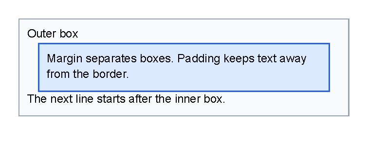
Margin, Padding And Border
Use margin to create space outside a control.
Use padding to create space between a container edge and its children.
Use thickness on border when you want the border line itself to be visible.
If a border should fit near its content instead of stretching through the available vertical space,
set verticalAlignment="top".
Separate Two Controls
Put margin on the control that needs outside space.
In the starter sample above, the inner border uses margin="3mm 0" so there is space before and after the box:
<border margin="3mm 0" padding="2mm" thickness="1pt">
    <text fontsize="9">Margin separates this box from nearby content.</text>
</border>
Use this when headings, rows, boxes or separator lines are too close to the controls around them.
Keep Content Away From An Edge
Put padding on the container that owns the inside edge.
For example, a border with padding="2mm" keeps its child text away from the border line:
<border padding="2mm" thickness="1pt">
    <text fontsize="9">Padding keeps this text away from the border.</text>
</border>
Use this for callout boxes, table cells and backgrounds behind text.
If the gap should be outside the box instead, use margin.
Draw A Visible Border
Use thickness, color and optional background on border.
One thickness value applies to every side:
<border thickness="1pt" color="#94a3b8" background="#f8fafc" padding="2mm">
    <text fontsize="9">A visible box.</text>
</border>
For a one-sided rule, use the four-value order left top right bottom,
such as thickness="0 0 0 1pt" for a bottom border.
The focused Border control page has a generated bottom-rule example.
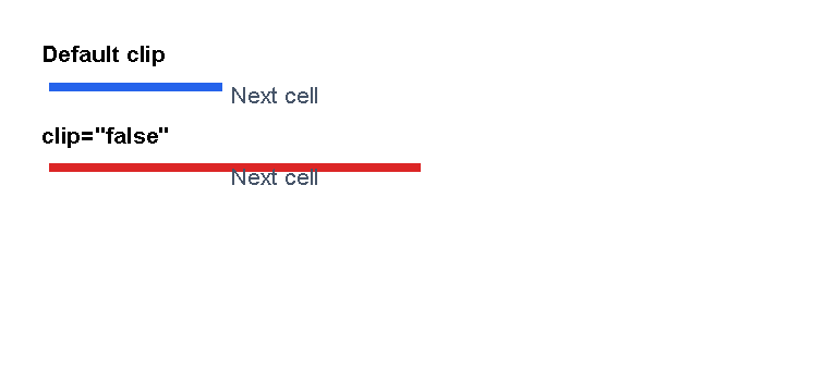
Clipping And Overflow
Most controls support clip.
The default is true, which trims drawing to the control’s arranged box.
That is usually what you want inside table cells, fixed areas and other tight layouts.
Set clip="false" only when overlap is intentional.
Try margin, padding, width or alignment changes first if content is being cut off by accident.
<?xml version="1.0" encoding="utf-8"?>
<template>
    <body>
        <text fontsize="8" weight="bold">Default clip</text>
        <table margin="0 0 2mm 0">
            <tr>
                <td width="22mm" padding="1mm">
                    <line length="45mm" thickness="3pt" color="#2563eb"/>
                </td>
                <td width="1*" padding="1mm">
                    <text fontsize="8" foreground="#475569">Next cell</text>
                </td>
            </tr>
        </table>
        <text fontsize="8" weight="bold">clip="false"</text>
        <table>
            <tr>
                <td width="22mm" padding="1mm" clip="false">
                    <line length="45mm" thickness="3pt" color="#dc2626"/>
                </td>
                <td width="1*" padding="1mm">
                    <text fontsize="8" foreground="#475569">Next cell</text>
                </td>
            </tr>
        </table>
    </body>
</template>

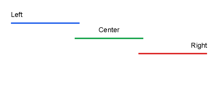
Alignment
Use horizontalAlignment to place a control left, center, right or stretched across the available width.
Use verticalAlignment to place a control top, center, bottom or stretched across the available height.
Alignment is applied after the control has been measured and arranged, so it moves the arranged control within the
space offered by its parent.
It does not turn content into rows or columns, and it does not replace table column widths.
The supported values are:
| Attribute | Values |
|---|---|
horizontalAlignment |
Left, Center, Right, Stretch |
verticalAlignment |
Top, Center, Bottom, Stretch |
Attribute names and enum values are matched case-insensitively by the control parameter binding path, but this manual uses lowercase attribute names and title-case enum values for readability.
Use alignment for small placement decisions:
- Put a short line or label on the left, center or right side of its available width.
- Right-align numbers by setting
horizontalAlignment="right"on thetextinside the table cell. - Keep a box near its content with
verticalAlignment="top"when the parent offers more height than the box needs. - Leave
Stretchas the default when the control should use the normal available space.
If content needs tabular columns, use Table control.
If content should flow through newsletter-style columns, use the built-in columns control.
If fixed page coordinates matter, use Areas.
<?xml version="1.0" encoding="utf-8"?>
<template>
    <body>
        <text fontsize="9">Left</text>
        <line length="35%" thickness="2pt" color="#2563eb" horizontalAlignment="left" margin="0 1mm"/>
        <text fontsize="9" horizontalAlignment="center">Center</text>
        <line length="35%" thickness="2pt" color="#16a34a" horizontalAlignment="center" margin="0 1mm"/>
        <text fontsize="9" horizontalAlignment="right">Right</text>
        <line length="35%" thickness="2pt" color="#dc2626" horizontalAlignment="right" margin="0 1mm"/>
    </body>
</template>

Orientation Values
Some controls use orientation to choose the direction of a visual element.
| Value | Meaning | Common use |
|---|---|---|
Horizontal |
Runs left to right. | Default for line. |
Vertical |
Runs top to bottom. | Default for barChart. |
Use orientation only on controls that document it. For example, Line control uses it to choose line direction, and Chart controls use it for vertical or horizontal bars.
<line orientation="Vertical" length="25mm" thickness="1pt" color="#475569"/>
<barChart orientation="Horizontal" height="55mm">
    <data x="0" y="12"/>
    <data x="1" y="19"/>
</barChart>
Lengths
Lengths are used for values such as margins, padding, line length, line thickness and area coordinates.
| Format | Meaning | Example |
|---|---|---|
| Number without a unit | Pixels. | 12 |
px |
Pixels. | 12px |
pt |
Points. Useful for line thickness and font-related sizing. | 1pt |
mm |
Millimeters. | 5mm |
cm |
Centimeters. | 1cm |
in |
Inches. | 1in |
% |
Percentage of available width or height for that value. | 50% |
auto |
The available size. | auto |
<?xml version="1.0" encoding="utf-8"?>
<template>
    <body>
        <text fontsize="9">30mm fixed length</text>
        <line length="30mm" thickness="2pt" color="#2f5597" margin="0 1mm"/>
        <text fontsize="9">50% of available width</text>
        <line length="50%" thickness="2pt" color="orange" margin="0 1mm"/>
        <text fontsize="9">Transparent background color</text>
        <border
            thickness="1pt"
            color="#166534"
            background="#dcfce7aa"
            padding="2mm"
            margin="1mm 0 0 0"
            verticalAlignment="top">
            <text fontsize="9">Colors can use names or hex values.</text>
        </border>
    </body>
</template>

Compare Length Units
Use the unit that matches the value you are setting. Millimeters and centimeters are convenient for print layout. Points are useful when matching line thickness or font-related sizes. Percentages are useful when a length should grow or shrink with the available space.
<?xml version="1.0" encoding="utf-8"?>
<template>
    <body>
        <text fontsize="8">30mm fixed length</text>
        <line length="30mm" thickness="2pt" color="#2563eb" margin="0 0 0 1mm"/>
        <text fontsize="8">3cm fixed length</text>
        <line length="3cm" thickness="2pt" color="#16a34a" margin="0 0 0 1mm"/>
        <text fontsize="8">85pt fixed length</text>
        <line length="85pt" thickness="2pt" color="#f59e0b" margin="0 0 0 1mm"/>
        <text fontsize="8">50% of available width</text>
        <line length="50%" thickness="2pt" color="#dc2626"/>
    </body>
</template>
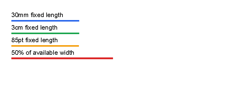

The first three lines are fixed physical lengths and are almost the same size. The percentage line is relative to the current available width, so it changes when the parent space changes.
Colors
Colors can be written as hex values or known color names.
| Format | Example |
|---|---|
| Short RGB | #f00 |
| Short RGBA | #f00f |
| RGB | #ff0000 |
| RGBA | #ff0000ff |
| Named color | red, orange, black, white, transparent |
Use RGBA when you need transparency. The last two hex digits are the alpha value.
Thickness Values
margin, padding and border thickness use thickness values.
A thickness is one, two or four lengths separated by spaces.
| Format | Meaning | Example |
|---|---|---|
| One value | Same value on all sides. | 2mm |
| Two values | Left/right first, top/bottom second. | 3mm 1mm |
| Four values | Left, top, right, bottom. | 1mm 2mm 3mm 4mm |
Use one value first. Only use two or four values when the sides really need to differ.
Common Layout Mistakes
- Using
paddingwhen you meant outside space. Usemarginto separate one control from the next. - Forgetting that page margin is document setup, not a
bodyXML attribute. See First document. - Expecting page margin to move fixed areas. Area coordinates are measured from the page edge; see Areas.
- Using fixed areas for content that should continue onto later pages. Put flowing content in
body. - Expecting a table row to split across pages. Keep rows short or split large content into several rows.
- Using percentages without checking the parent space. Percentages change when the available area changes.
- Letting a container stretch when it should fit content. Add
verticalAlignment="top"to aborderwhen needed. - Turning off
clipto hide a layout problem. Useclip="false"only for deliberate overlap.
Use Styles when the same layout attributes should be reused on many controls.
| Previous: Template data | Manual home | Next: Styles |