Papercraft Manual
User-facing documentation for Papercraft XML templates and the X39.Solutions.PdfTemplate compatibility bridge.
Line Control
| Controls | Manual home |
What Is This?
The line control draws a straight horizontal or vertical line.
It is a leaf control: it renders a line by itself and does not contain other controls.
Use lines as simple separators between sections, header rules, footer rules or small visual marks.
When Should I Use This?
Use line when the document needs one straight rule.
Use border instead when content needs a box, a background color or a border on one side of a container.
A line is usually a small supporting element.
Keep the surrounding content in text, border, table or another control.
How Do I Start?
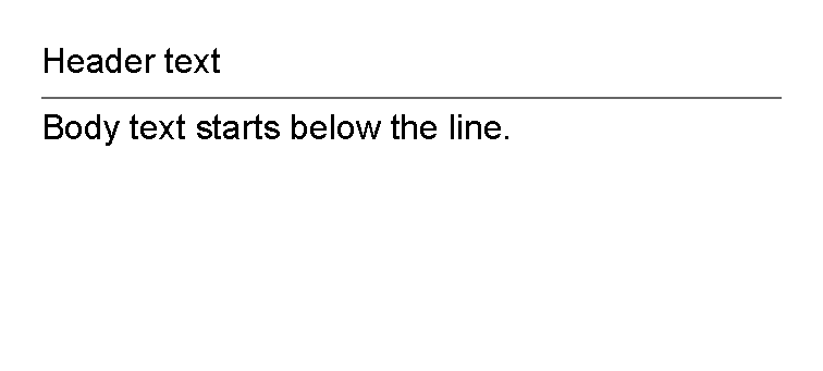
Start with a horizontal separator between two text controls.
<?xml version="1.0" encoding="utf-8"?>
<template>
    <body>
        <text>Header text</text>
        <line thickness="1pt" length="100%" color="#666666" margin="0 1mm"/>
        <text>Body text starts below the line.</text>
    </body>
</template>

Draw A Horizontal Line
Leave orientation unset, or set it to Horizontal, when the line should run from left to right.
For a simple separator, give the line a small thickness, a useful length and a little vertical margin:
<line thickness="1pt" length="100%" color="#666666" margin="0 1mm"/>
Choose Length And Thickness
Use length for how far the line travels.
Use thickness for how wide the stroke is.
For shared value formats, see Lengths and
Thickness values.
For a horizontal line, length is measured along the available width and thickness uses the vertical axis.
For a vertical line, length is measured along the available height and thickness uses the horizontal axis.
Set both values explicitly for predictable output.
The default length and thickness are auto, which means the line can fill the available space.
Change Color
Use color to set the line color.
The value uses the same color formats documented in Layout fundamentals.
Common examples:
| Need | Example value |
|---|---|
| Neutral rule | #666666 |
| Light divider | #d1d5db |
| Brand accent | #1d4ed8 |
| Named color | red |
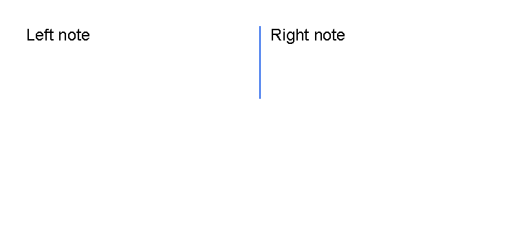
Use Vertical Lines
Set orientation="vertical" when the line should run from top to bottom.
The supported orientation values are Horizontal and Vertical; attribute binding accepts values case-insensitively.
For the shared value reference, see Orientation values.
Vertical lines are often easier to place inside a fixed area or a table cell than directly in the normal body flow. For fixed-position content, see First document.
<?xml version="1.0" encoding="utf-8"?>
<template>
    <body>
        <table>
            <tr>
                <td width="2*">
                    <text fontsize="9">Left note</text>
                </td>
                <td width="4mm">
                    <line
                        orientation="vertical"
                        length="14mm"
                        thickness="1pt"
                        color="#2563eb"
                        horizontalAlignment="center"/>
                </td>
                <td width="2*">
                    <text fontsize="9">Right note</text>
                </td>
            </tr>
        </table>
    </body>
</template>

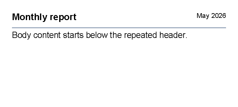
Use Lines As Header Or Table Separators
Use a horizontal line after header content when every page should have the same rule under the heading.
<?xml version="1.0" encoding="utf-8"?>
<template>
    <header>
        <table>
            <tr>
                <td width="1*">
                    <text fontsize="11" weight="bold">Monthly report</text>
                </td>
                <td width="1*">
                    <text fontsize="8" horizontalAlignment="right">May 2026</text>
                </td>
            </tr>
        </table>
        <line thickness="1pt" length="100%" color="#94a3b8" margin="0 1mm"/>
    </header>
    <body>
        <text fontsize="10">Body content starts below the repeated header.</text>
    </body>
</template>

Inside a table, use a vertical line in a narrow td when it should separate two neighboring blocks.
Use a border with bottom thickness instead when every row needs a horizontal rule.
For that row-rule pattern, see Draw Only A Bottom Border.
Supported Attributes
| Attribute | Use it for | Values |
|---|---|---|
thickness |
Stroke thickness. | Any supported length, default auto. |
length |
Line length. | Any supported length, default auto. |
orientation |
Horizontal or vertical direction. | Horizontal or Vertical, default Horizontal. |
color |
Stroke color. | Any supported color, default black. |
The line control also supports the shared margin, padding, clip, horizontalAlignment
and verticalAlignment attributes described in Layout fundamentals.
Allowed Children
line does not allow child controls or text content.
Use it as a self-closing element, such as <line thickness="1pt" length="100%" color="#666666"/>.
Common Mistakes
- Omitting
thicknessorlength; the defaults are usually too large for a separator. - Using
linefor a content box. Useborderwhen content needs an outline or background. - Forgetting margin around the line, which can leave adjacent text too close to the rule.
- Setting a vertical line in normal body flow when a fixed
areaor table cell would be easier to control.
| Controls | Manual home |