Papercraft Manual
User-facing documentation for Papercraft XML templates and the X39.Solutions.PdfTemplate compatibility bridge.
Flow Helper Controls
| Previous: Rich text controls | Controls | Next: List controls |
What Is This?
Flow helper controls affect how visible controls are grouped, spaced, split across pages or arranged into columns. They are built-in Papercraft Core controls registered by the normal service setup.
When Should I Use This?
Use these controls when the document needs structure around other visible controls:
- Use
blockto group stacked controls, keep the group together and optionally add a background or page break behavior. - Use
spacerto reserve blank space. - Use
pageBreakto advance body flow to the next page. - Use
columnsto flow whole child controls through multiple columns.
Use table instead when the content is tabular rows and cells.
How Do I Start?
These fragments mirror BlockControlTests, FlowControlTests and ColumnsControlTests:
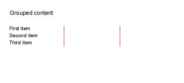
<block background="#f8fafc" minHeight="12px" padding="2px">
    <text fontsize="9">Grouped content</text>
</block>

<spacer height="4mm"/>

<columns count="3" gap="7px" ruleThickness="2px" ruleColor="#dc2626">
    <text fontsize="8">First item</text>
    <text fontsize="8">Second item</text>
    <text fontsize="8">Third item</text>
</columns>

block and columns can contain normal controls.
spacer and pageBreak are leaf controls and should not contain child controls.
Use <pageBreak/>, pageBreakBefore or pageBreakAfter when a flow section should move to another page.
When a block fits on an empty body page but not in the remaining body space, Papercraft moves the whole block to
the next page before rendering its children. If a block is taller than a full body page, Papercraft renders it in normal
flow so child controls can continue across pages instead of looping forever.
Supported Controls
| Control | Children | Use |
|---|---|---|
block |
Normal controls | Stack children vertically, keep the group together when it fits on an empty body page, draw an optional background and request page breaks before or after the group. |
spacer |
None | Reserve empty width and height without drawing. |
pageBreak |
None | Advance body flow to the next page when not already at a page boundary. |
columns |
Normal controls | Flow whole child controls through a configured number of columns. |
Supported Attributes
| Control | Attributes |
|---|---|
block |
background, minHeight, pageBreakBefore, pageBreakAfter, shared layout attributes. |
spacer |
width, height, shared alignment attributes. |
pageBreak |
Shared layout attributes only; no control-specific attributes. |
columns |
count, gap, ruleThickness or rule-thickness, ruleColor or rule-color, shared layout attributes. |
For length values and shared layout attributes, see Layout fundamentals.
Common Mistakes
- Using
columnsfor data tables. Usetablewhen rows and cells matter. - Assuming
columnssplits a child control between columns. It flows whole child controls. - Expecting
spacerorpageBreakto draw visible output. - Using
pageBreakin fixed areas where normal body flow is not the main layout mechanism.
| Previous: Rich text controls | Controls | Next: List controls |