Papercraft Manual
User-facing documentation for Papercraft XML templates and the X39.Solutions.PdfTemplate compatibility bridge.
Table Control
| Controls | Manual home |
What Is This?
The table control arranges content into rows and columns.
It uses th for a table header row, tr for normal rows and td for cells.
Table controls create the layout and can draw row or cell backgrounds and borders.
The table element itself is layout-only; put visible fills and rules on th, tr or td.
Use td padding for spacing inside cells.
Use border inside a cell only when the cell content itself needs a separate boxed layout.
When Should I Use This?
Use table when content belongs in columns: invoice line items, totals, small comparison blocks,
addresses side by side or values that should line up by column.
Do not use a table just to add a box around one piece of text. Use Border control for boxes and backgrounds, and use Line control for standalone separators.
How Do I Start?
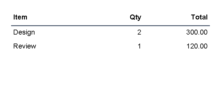
Start with one table, one header row and a few normal rows.
Each th or tr contains td cells.
<?xml version="1.0" encoding="utf-8"?>
<template>
    <body>
        <table>
            <th borderThickness="0 0 0 1pt" borderColor="#475569">
                <td padding="1mm">
                    <text fontsize="9" weight="bold">Item</text>
                </td>
                <td padding="1mm">
                    <text fontsize="9" weight="bold" horizontalAlignment="right">Qty</text>
                </td>
                <td padding="1mm">
                    <text fontsize="9" weight="bold" horizontalAlignment="right">Total</text>
                </td>
            </th>
            <tr>
                <td padding="1mm"><text fontsize="9">Design</text></td>
                <td padding="1mm"><text fontsize="9" horizontalAlignment="right">2</text></td>
                <td padding="1mm"><text fontsize="9" horizontalAlignment="right">300.00</text></td>
            </tr>
            <tr>
                <td padding="1mm"><text fontsize="9">Review</text></td>
                <td padding="1mm"><text fontsize="9" horizontalAlignment="right">1</text></td>
                <td padding="1mm"><text fontsize="9" horizontalAlignment="right">120.00</text></td>
            </tr>
        </table>
    </body>
</template>

Add A Table Header
Use th for a header row.
The header row uses the same td cells as normal rows, but TableControl treats it as the table header and repeats it
when the table continues on a later page.
<table>
    <th borderThickness="0 0 0 1pt" borderColor="#475569">
        <td padding="1mm"><text weight="bold">Item</text></td>
        <td padding="1mm"><text weight="bold">Total</text></td>
    </th>
    <tr>
        <td><text>Design</text></td>
        <td><text>300.00</text></td>
    </tr>
</table>
For page-break behavior and repeated headers, see A table breaks or overflows unexpectedly.
Create A Two-Column Layout
Use one table row with two td cells when content should sit side by side.
Give both cells the same star width, such as width="1*", when the columns should share the available width equally.
Use cell background, borderThickness and borderColor when the cell itself needs a visible box.
<?xml version="1.0" encoding="utf-8"?>
<template>
    <body>
        <table>
            <tr>
                <td
                    width="1*"
                    borderThickness="1pt"
                    borderColor="#cbd5e1"
                    background="#f8fafc"
                    padding="2mm"
                    verticalAlignment="top">
                    <text fontsize="9" weight="bold">Bill to</text>
                    <text fontsize="8">Mira Lane</text>
                    <text fontsize="8">42 Market Street</text>
                </td>
                <td
                    width="1*"
                    borderThickness="1pt"
                    borderColor="#67e8f9"
                    background="#ecfeff"
                    padding="2mm"
                    verticalAlignment="top">
                    <text fontsize="9" weight="bold">Ship to</text>
                    <text fontsize="8">Warehouse North</text>
                    <text fontsize="8">Dock 3</text>
                </td>
            </tr>
        </table>
    </body>
</template>
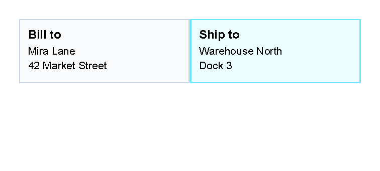

Use this pattern for addresses, small summary blocks or side-by-side labels. For many repeated rows, keep using normal table rows instead of nesting large layouts inside one cell.
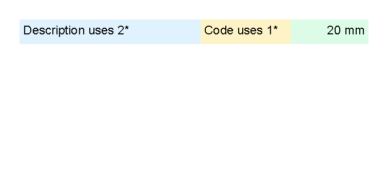
Set Column Widths
Use the width attribute on td cells to guide column sizing.
The table reads the width requests from cells in the same column.
Useful width forms are:
1*,2*and similar star values for weighted parts of the remaining space.- Lengths such as
20mm,2cm,72ptor25%. autowhen the column should use the measured content width.
For fixed and percent length formats, see Lengths.
<?xml version="1.0" encoding="utf-8"?>
<template>
    <body>
        <table>
            <tr>
                <td width="2*" background="#e0f2fe" padding="1mm">
                    <text fontsize="9">Description uses 2*</text>
                </td>
                <td width="1*" background="#fef3c7" padding="1mm">
                    <text fontsize="9">Code uses 1*</text>
                </td>
                <td width="20mm" background="#dcfce7" padding="1mm">
                    <text fontsize="9" horizontalAlignment="right">20 mm</text>
                </td>
            </tr>
        </table>
    </body>
</template>

Align Numbers To The Right
Use horizontalAlignment="right" on the text control inside a cell when numbers should line up on the right side.
The table controls position the cell; the text control positions the text inside that cell.
<td padding="1mm">
    <text fontsize="9" horizontalAlignment="right">120.00</text>
</td>
Create An Invoice Line-Item Table
Use one th row for the column labels and one tr row for each line item.
Put visible padding on the td cells.
Use background, borderThickness and borderColor on rows or cells when the table needs fills or rules.
Right-align quantities, prices and totals with the text control.
The full invoice preview uses the same structure:
<table>
    <th borderThickness="0 0 0 1pt" borderColor="#334155">
        <td width="2*" padding="1mm"><text weight="bold">Description</text></td>
        <td width="1*" padding="1mm"><text weight="bold" horizontalAlignment="right">Qty</text></td>
        <td width="1*" padding="1mm"><text weight="bold" horizontalAlignment="right">Amount</text></td>
    </th>
    <tr>
        <td padding="1mm"><text>Design package</text></td>
        <td padding="1mm"><text horizontalAlignment="right">2</text></td>
        <td padding="1mm"><text horizontalAlignment="right">690.00</text></td>
    </tr>
</table>
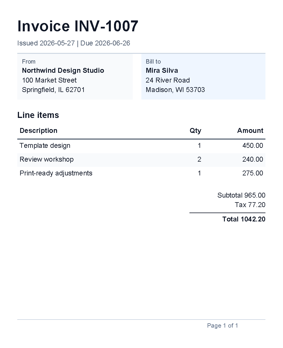

For a full document shape, see the generated Invoice example. If invoice rows come from application data, start with Repeat rows from data when each row can be represented by one simple value. Multi-field invoice row objects are not documented as a supported template-author pattern yet; ask the application team for prepared simple values or helper functions until a supported nested-data pattern exists.
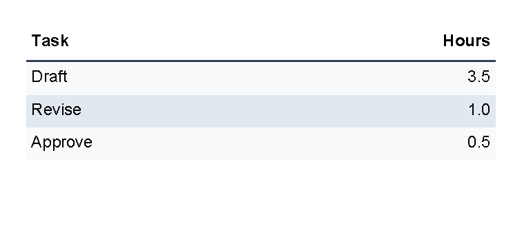
Alternate Row Colors
Use @alternate to rotate through background colors.
Set background on the row when the whole row should share the same fill.
<?xml version="1.0" encoding="utf-8"?>
<template>
    <body>
        <table>
            <th borderThickness="0 0 0 1pt" borderColor="#334155">
                <td width="2*" padding="1mm">
                    <text fontsize="9" weight="bold">Task</text>
                </td>
                <td width="1*" padding="1mm">
                    <text fontsize="9" weight="bold" horizontalAlignment="right">Hours</text>
                </td>
            </th>
            @alternate on RowBackground with ["#f8fafc", "#e2e8f0"] {
            <tr background="@RowBackground">
                <td padding="1mm"><text fontsize="9">Draft</text></td>
                <td padding="1mm"><text fontsize="9" horizontalAlignment="right">3.5</text></td>
            </tr>
            }
            @alternate on RowBackground {
            <tr background="@RowBackground">
                <td padding="1mm"><text fontsize="9">Revise</text></td>
                <td padding="1mm"><text fontsize="9" horizontalAlignment="right">1.0</text></td>
            </tr>
            }
            @alternate on RowBackground {
            <tr background="@RowBackground">
                <td padding="1mm"><text fontsize="9">Approve</text></td>
                <td padding="1mm"><text fontsize="9" horizontalAlignment="right">0.5</text></td>
            </tr>
            }
        </table>
    </body>
</template>

For more transformer syntax, see Template language.
Repeat Rows From Data
Use @foreach when the application supplies a list and the table should add one tr for each item.
Keep the repeated block small: one loop, one row and the cells that belong to that row.
<?xml version="1.0" encoding="utf-8"?>
<template>
    <body>
        <table>
            <th borderThickness="0 0 0 1pt" borderColor="#334155">
                <td width="2*" padding="1mm">
                    <text fontsize="9" weight="bold">Task from data</text>
                </td>
                <td width="1*" padding="1mm">
                    <text fontsize="9" weight="bold" horizontalAlignment="right">Status</text>
                </td>
            </th>
            @foreach TaskName in Tasks {
            @alternate on RowBackground with ["#ffffff", "#f1f5f9"] {
            <tr background="@RowBackground">
                <td padding="1mm"><text fontsize="9">@TaskName</text></td>
                <td padding="1mm"><text fontsize="9" horizontalAlignment="right">Ready</text></td>
            </tr>
            }
            }
        </table>
    </body>
</template>
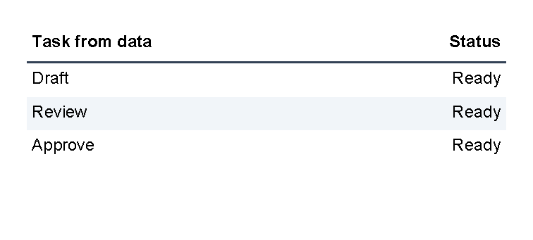

The application must supply Tasks as a collection of text values.
The loop creates a temporary TaskName value for the current item.
The nested @alternate block is optional; it only rotates the row background colors.
Multi-field row objects are not documented as a supported template-author pattern yet.
For current nested-data guidance, see Template data.
Supported Attributes
table supports the shared margin, padding, clip, horizontalAlignment and verticalAlignment attributes
described in Layout fundamentals.
th and tr support those shared attributes plus:
| Attribute | Use it for | Values |
|---|---|---|
background |
Fill behind the whole row. | Any supported color, default transparent. |
borderThickness |
Width of the row border sides. | Any supported thickness value, default 0. |
borderColor |
Row border color. | Any supported color, default transparent. |
td supports those shared attributes plus:
| Attribute | Use it for | Values |
|---|---|---|
width |
Requested column width. | auto, any supported length or percent value, or star values such as 1* and 2*. |
columnSpan |
Make one cell span more than one column. | Whole number, default 1; source notes that 0 is ignored. |
background |
Fill behind the cell. | Any supported color, default transparent. |
borderThickness |
Width of the cell border sides. | Any supported thickness value, default 0. |
borderColor |
Cell border color. | Any supported color, default transparent. |
Allowed Children
table can contain th and tr.
th and tr can contain td.
td can contain visible controls such as text, border, line, another table or other registered controls.
Children inside one td are stacked vertically.
A header row is rendered before normal rows, and TableControl renders header rows again when a table continues
after a page break.
Common Mistakes
- Expecting
tableitself to draw visible grid lines. AddborderThicknessandborderColortoth,trortd. - Putting
textdirectly insidetableortr. Put visible content inside atd. - Forgetting that
this a table header row in this template language, not a header cell. - Using table layout for a single highlighted box. Use
borderfor that. - Expecting a long row to split across pages. A table row is kept together; see A table breaks or overflows unexpectedly.
- Making one large table example before checking the smaller row, width and alignment pieces.
| Controls | Manual home |