Papercraft Manual
User-facing documentation for Papercraft XML templates and the X39.Solutions.PdfTemplate compatibility bridge.
Border Control
| Controls | Manual home |
What Is This?
The border control draws a box, border line or background behind other controls.
It is a container control: put text, line, another border or another visible control inside it.
Use border for callout boxes, highlighted totals, section headings, backgrounds behind text,
or one-sided rules that belong to a piece of content.
When Should I Use This?
Use border when visible content needs an outline, a background color or padding inside a box.
Use line instead when the document only needs a standalone separator.
Use table controls instead when the content is rows and columns.
The border control is also useful when a text block needs a bottom rule,
because the rule stays attached to the content inside the border.
How Do I Start?
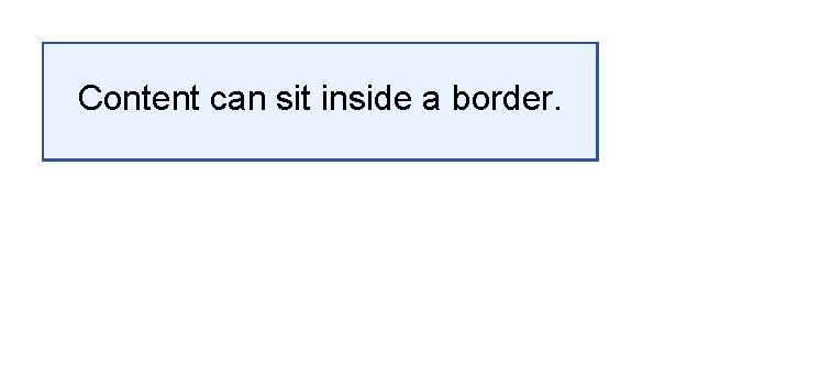
Start with a border around one text control.
Use thickness for the border width, color for the border line and background for the fill.
Use padding to keep the text away from the border line.
<?xml version="1.0" encoding="utf-8"?>
<template>
    <body>
        <border
            thickness="1pt"
            color="#2f5597"
            background="#eaf2ff"
            padding="4mm"
            horizontalAlignment="left"
            verticalAlignment="top">
            <text>Content can sit inside a border.</text>
        </border>
    </body>
</template>

Draw Only A Bottom Border
Use a four-part thickness value when only one side should be visible.
The order is left, top, right, bottom.
For the shared thickness format, see Thickness values.
<?xml version="1.0" encoding="utf-8"?>
<template>
    <body>
        <border
            thickness="0 0 0 1pt"
            color="#64748b"
            padding="0 0 1.5mm 0"
            margin="0 0 3mm 0"
            verticalAlignment="top">
            <text fontsize="14" weight="bold">Section title</text>
        </border>
        <text fontsize="10" foreground="#475569">The next content starts below the rule.</text>
    </body>
</template>

Control The Box Size
The border control supports the shared horizontalAlignment and verticalAlignment attributes.
Their default value is Stretch, so a border may fill the available width or height.
Use horizontalAlignment="left" and verticalAlignment="top" when the border should fit its content.
Use stretch when the border should act as a full-width section background or rule.
For the shared spacing and alignment model, see Layout fundamentals.
Supported Attributes
| Attribute | Use it for | Values |
|---|---|---|
thickness |
Width of the border sides. | Any supported thickness value, default 0. |
color |
Border line color. | Any supported color, default transparent. |
background |
Fill behind the child controls. | Any supported color, default transparent. |
The border control also supports the shared margin, padding, clip, horizontalAlignment
and verticalAlignment attributes described in Layout fundamentals.
Allowed Children
border can contain built-in child controls and registered custom controls.
Children are arranged one after another inside the border.
Use padding on the border when the child content should not touch the border line.
Common Mistakes
- Forgetting
padding, which can leave text too close to the border line. - Leaving the default stretch alignment when the border should fit tightly around the content.
- Using
borderfor a standalone separator. Uselinewhen there is no content inside the rule. - Trying to create table rows with nested borders. Use table controls for real rows and columns.
- Using one
thicknessvalue when only one side should be visible. Use four values for side-specific borders.
| Controls | Manual home |