Papercraft Manual
User-facing documentation for Papercraft XML templates and the X39.Solutions.PdfTemplate compatibility bridge.
Chart Controls
| Controls | Manual home |
What Is This?
Chart controls draw simple data charts inside the document.
Use the outer chart control as the container, then place one or more chart types inside it:
lineChart, barChart or pieChart.
Each chart reads small data elements.
Line and bar charts use numeric x and y values.
Pie charts use numeric y values for slice sizes.
When Should I Use This?
Use chart controls when the PDF should show a compact visual summary, such as orders over time, open items by category or a share of totals.
Use a table instead when readers need exact row-by-row values. Use text or a border when the value is a single number or status.
How Do I Start?
Start with one chart container and one chart inside it.
Give the chart a fixed height, then add a few data rows.
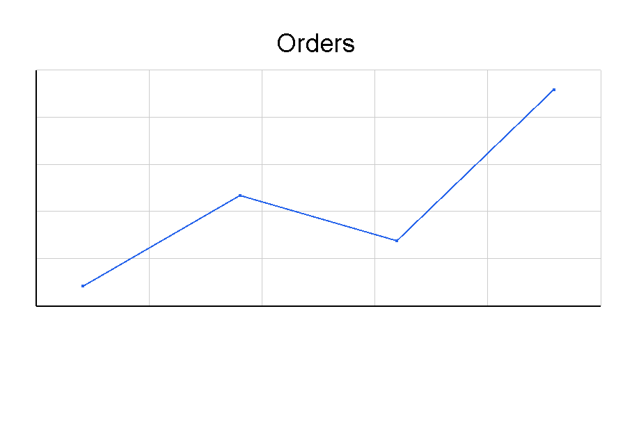
<?xml version="1.0" encoding="utf-8"?>
<template>
    <body>
        <chart>
            <lineChart height="55mm" title="Orders" line-color="#2563eb">
                <data x="0" y="18"/>
                <data x="1" y="24"/>
                <data x="2" y="21"/>
                <data x="3" y="31"/>
            </lineChart>
        </chart>
    </body>
</template>

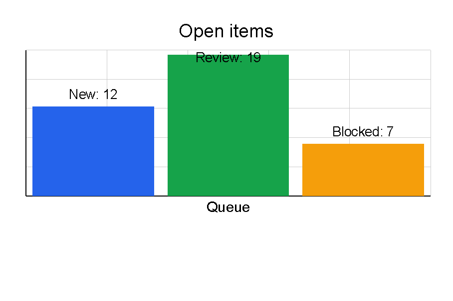
Create A Bar Chart
Use barChart when separate values should be compared side by side.
The default orientation is vertical.
For horizontal bars, set orientation="Horizontal"; the shared values are listed in
Orientation values.
Set color on individual data elements when each bar should have its own color.
Use label for short bar labels, and set show-data-labels="true" when numeric values should be drawn too.
For color formats, see Colors.
<?xml version="1.0" encoding="utf-8"?>
<template>
    <body>
        <chart>
            <barChart height="55mm" title="Open items" show-data-labels="true" x-axis-label="Queue">
                <data x="0" y="12" label="New" color="#2563eb"/>
                <data x="1" y="19" label="Review" color="#16a34a"/>
                <data x="2" y="7" label="Blocked" color="#f59e0b"/>
            </barChart>
        </chart>
    </body>
</template>

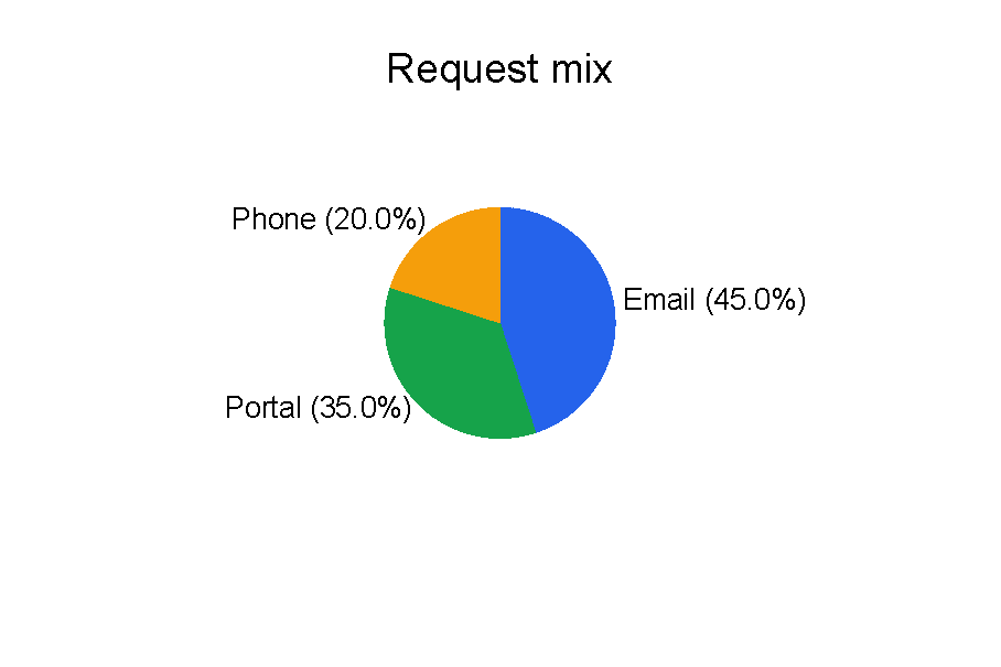
Create A Pie Chart
Use pieChart when each value is part of one total.
Pie chart slices need y values; x is optional.
Use label when the slice name should be drawn, and keep labels short so they fit inside the chart area.
Use pie-label-position to choose Outside, Inside, Legend or Auto placement.
<?xml version="1.0" encoding="utf-8"?>
<template>
    <body>
        <chart>
            <pieChart height="60mm" title="Request mix" pie-label-position="Outside">
                <data y="45" label="Email" color="#2563eb"/>
                <data y="35" label="Portal" color="#16a34a"/>
                <data y="20" label="Phone" color="#f59e0b"/>
            </pieChart>
        </chart>
    </body>
</template>

Provide Chart Data
Keep chart data numeric and small.
The current controls parse values with invariant number formatting, so use 3.5 rather than a localized decimal comma.
Line and bar chart data elements need both x and y.
Pie chart data elements need y; when x is omitted, the control can still render the slice.
<lineChart height="40mm">
    <data x="0" y="10"/>
    <data x="1" y="15"/>
</lineChart>
Invalid or missing values are ignored by the chart data parser. If no valid data remains, the chart renders a “No Data” message. For troubleshooting steps, see A chart shows no data or missing values.
Supported Attributes
chart supports the shared margin, padding, clip, horizontalAlignment and verticalAlignment
attributes described in Layout fundamentals.
lineChart, barChart and pieChart support these shared chart attributes:
| Attribute | Use it for | Values |
|---|---|---|
width |
Chart width. | Any supported length or percent value, default 100%. |
height |
Chart height. | Any supported length or percent value, default 300px. |
title |
Title text drawn above the chart. | Text. |
show-grid |
Show grid lines on line and bar charts. | true or false, default true. |
grid-color |
Grid line color. | Any supported color, default light gray. |
axis-color |
Axis and title text color. | Any supported color, default black. |
show-x-axis |
Show the horizontal axis on line and bar charts. | true or false, default true. |
show-y-axis |
Show the vertical axis on line and bar charts. | true or false, default true. |
x-axis-label |
Visible X-axis label for line and bar charts. | Text. |
y-axis-label |
Visible Y-axis label for line and bar charts. | Text. |
show-data-labels |
Show automatic numeric y labels for line and bar chart data. |
true or false, default false. |
lineChart also supports:
| Attribute | Use it for | Values |
|---|---|---|
line-thickness |
Stroke thickness of the line. | Any supported length, default 2px. |
line-color |
Stroke and point color. | Any supported color, default first chart palette color. |
show-points |
Draw point markers. | true or false, default true. |
point-size |
Size of point markers. | Number, default 4. |
barChart also supports:
| Attribute | Use it for | Values |
|---|---|---|
orientation |
Vertical or horizontal bars. | Vertical or Horizontal, default Vertical. |
bar-width |
Fixed bar width; 0 lets the control calculate it. |
Any supported length, default 0px. |
bar-spacing |
Spacing between bars. | Percent-style length, default 10%. |
bar-color |
Default bar color. | Any supported color, default first chart palette color. |
pieChart also supports:
| Attribute | Use it for | Values |
|---|---|---|
start-angle |
Starting angle in degrees. | Number, default 0. |
inner-radius |
Donut-hole radius. | Percent or length, default 0%. |
show-percentages |
Draw percentage text beside slices. | true or false, default true. |
show-labels |
Draw slice labels from data label. |
true or false, default true. |
pie-label-position |
Where pie labels are placed. | Outside, Inside, Legend or Auto, default Outside. |
data supports:
| Attribute | Use it for | Values |
|---|---|---|
x |
X value for line and bar charts. | Invariant numeric text. |
y |
Y value or pie slice size. | Invariant numeric text. |
label |
Visible pie slice, bar or line point label. | Short text. |
x-label |
Fallback visible label for line or bar data. | Short text. |
y-label |
Fallback visible label for line or bar data. | Short text. |
color |
Color for a bar or pie slice. | Any supported color. |
Explicit data label, x-label and y-label render on line and bar charts.
Numeric y values render only when show-data-labels="true".
Allowed Children
chart can contain chart controls: lineChart, barChart and pieChart.
Each chart control can contain data.
data is a leaf control and does not render by itself.
Multiple charts inside one chart container are stacked vertically.
Common Mistakes
- Putting
datadirectly insidechart. PutdatainsidelineChart,barChartorpieChart. - Omitting chart
height; the default may be too large or too small for the surrounding page section. - Using text labels as
xory. The chart parser expects numeric values. - Expecting long chart labels to fit in a small chart area. Use shorter labels or
pie-label-position="Legend"for dense pie charts. - Using a chart when a small table would communicate the exact values more clearly.
| Controls | Manual home |