Papercraft Manual
User-facing documentation for Papercraft XML templates and the X39.Solutions.PdfTemplate compatibility bridge.
Text Control
| Controls | Manual home |
What Is This?
The text control renders words, labels and values in the document.
It is a leaf control: it displays text content, but it does not contain other controls.
Use text for headings, short paragraphs, labels, totals, status messages and values from template data.
When Should I Use This?
Use text whenever the visible document part is text.
If the text needs a surrounding box, background color or border line, put the text inside a border.
If the text changes for each generated document, insert a template-data value inside the text.
Do not use text to build rows and columns.
Use table controls for tabular content.
How Do I Start?
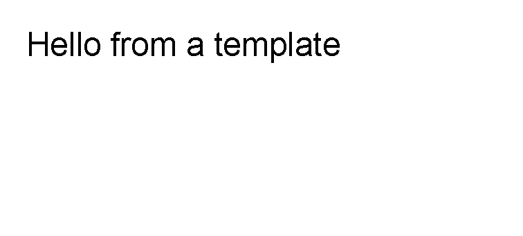
Start with plain text inside a body.
<?xml version="1.0" encoding="utf-8"?>
<template>
    <body>
        <text fontsize="18">Hello from a template</text>
    </body>
</template>

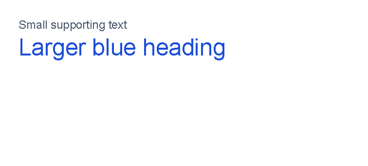
Change Size And Color
Use fontsize for the text size in points.
Use foreground for the text color.
See Layout fundamentals for supported color formats.
<?xml version="1.0" encoding="utf-8"?>
<template>
    <body>
        <text fontsize="9" foreground="#475569">Small supporting text</text>
        <text fontsize="18" foreground="#1d4ed8">Larger blue heading</text>
    </body>
</template>

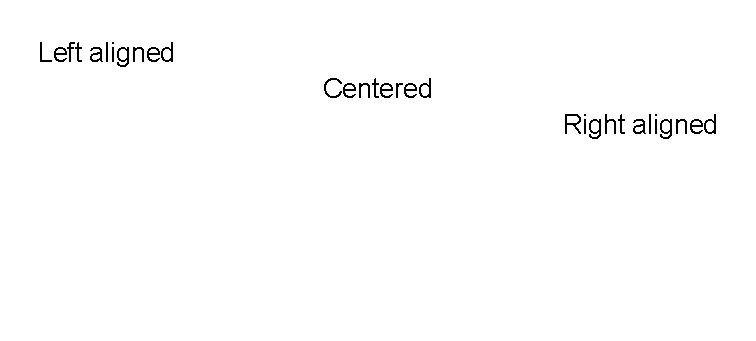
Align Text
Use horizontalAlignment to place a text control in the available width.
The supported values are Left, Center, Right and Stretch.
For the shared alignment model, see Alignment.
<?xml version="1.0" encoding="utf-8"?>
<template>
    <body>
        <text fontsize="10" horizontalAlignment="left">Left aligned</text>
        <text fontsize="10" horizontalAlignment="center">Centered</text>
        <text fontsize="10" horizontalAlignment="right">Right aligned</text>
    </body>
</template>

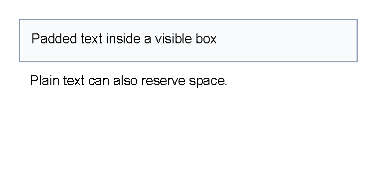
Add Padding Around Text
Use padding when text needs reserved space around it.
Padding on plain text creates extra space but does not draw a background.
When the padding should be visible, put the text inside a border with a background or border color.
<?xml version="1.0" encoding="utf-8"?>
<template>
    <body>
        <border background="#f8fafc" color="#94a3b8" thickness="1pt" verticalAlignment="top">
            <text fontsize="10" padding="3mm">Padded text inside a visible box</text>
        </border>
        <text fontsize="10" padding="3mm">Plain text can also reserve space.</text>
    </body>
</template>

Make Text Bold, Italic Or Decorated
Use weight="bold" for bold text.
Use style="italic" for italic text.
Named weights such as semiBold are accepted by the font-weight converter.
Use decoration for underline, strike-through and double underline.
<?xml version="1.0" encoding="utf-8"?>
<template>
    <body>
        <text fontsize="12" weight="bold">Bold text</text>
        <text fontsize="12" style="italic">Italic text</text>
        <text fontsize="12" weight="semiBold" foreground="#166534">Semi-bold green text</text>
        <text fontsize="12" decoration="underline">Underlined text</text>
        <text fontsize="12" decoration="strikeThrough">Strikethrough text</text>
        <text fontsize="12" decoration="doubleUnderline">Double-underlined text</text>
    </body>
</template>
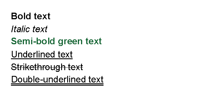

Decoration values can be combined, for example decoration="underline, strikeThrough".
Insert Data In Text
Put a variable such as @CustomerName where the changing value should appear.
The application must supply the value.
<?xml version="1.0" encoding="utf-8"?>
<template>
    <body>
        <text fontsize="14">Order @OrderNumber</text>
        <text>Hello @CustomerName</text>
        <text>Delivery: @DeliveryDate</text>
    </body>
</template>
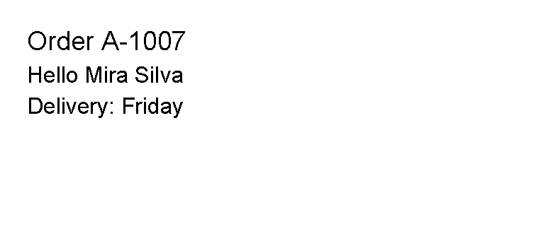

The application supplies the values named OrderNumber, CustomerName and DeliveryDate.
For missing values, functions and data-backed attributes, see Template data.
Supported Attributes
The examples use lowercase or lower-camel-case attributes.
Parameter binding is case-insensitive, so fontsize, FontSize and fontSize refer to the same text parameter.
| Attribute | Use it for | Values |
|---|---|---|
foreground |
Text color. | Any supported color. |
fontsize |
Font size in points. | Number, default 12. |
lineheight |
Distance between wrapped or multi-line text lines, relative to font size. | Number, default 1. |
scale |
Horizontal text scale. | Number, default 1. |
rotation |
Text skew/rotation parameter passed to the renderer. | Number, default 0. |
strokethickness |
Stroke thickness for drawing the text. | Number, default 1. |
decoration |
Text decoration. | none, underline, strikeThrough, doubleUnderline; values can be combined with commas. |
letterspacing |
Font width or letter-spacing value. | Number. |
weight |
Font weight. | Number or names such as normal, semiBold, bold. |
style |
Font slant. | normal, upright, italic, oblique. |
fontfamily |
Font family. | Font family name available to the renderer. |
text |
Text content as an attribute. | Any text. Prefer XML content for normal use. |
The text control also supports the shared margin, padding, clip, horizontalAlignment
and verticalAlignment attributes described in Layout fundamentals.
If both a text attribute and XML content are supplied, XML content is used as the control text.
Allowed Children
text does not allow child controls.
Write text directly between the opening and closing tags, such as
<text>Use this form for normal text.</text>.
Do not put controls inside text:
use a surrounding border, table cell or another container control instead.
Common Mistakes
- Using
textwhen aborderis needed for background color or a visible box. - Putting controls inside
text; use a container control such asborder,tableortdinstead. - Using
underlineontext; usedecoration="underline"instead. Theunderlineattribute is only forhyperlink. - Writing a long paragraph and assuming it will look right without checking the generated output.
| Controls | Manual home |